In 2021 around 2.8 million hospital admissions in the U.S. were due to infections in immunocompromised patients. The standard of care includes invasive, diagnostic tests that can cause complications for the patient, take too long to produce a result, or can sometimes fail to identify the causative pathogen.
As an alternative, The Karius Test is a liquid biopsy for infectious diseases that can rapidly and non-invasively detect over 1,000 pathogens in a small sample of blood.
Karius Report 2.0
Lead Product Designer
Redesigned the Karius Test diagnostic report to enhance clinical interpretability to improve patient outcomes
The need for the Karius Test
How does it work?
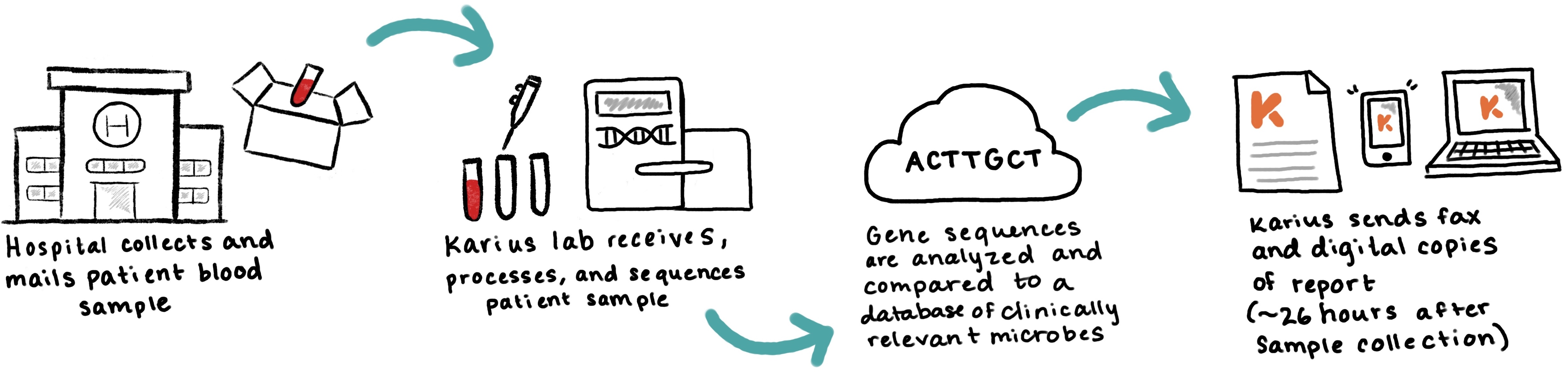
When a physician suspects an infection in their patient, they will order a Karius Test by sending a sample of the patient's blood, and once Karius' lab has processed the sample, they will receive a report with a result about 24 hours later.
Types of Karius test results
A test result can either be
- Positive - if at least 1 microbe was detected
- Negative - if no microbes were detected
- Inconclusive - if a result could not be determined due to a quality control failure or other issue
For the purpose of this case study, I will focus on the process of redesigning positive test results since these presented the most interpretability issues and the most opportunties for improvement.
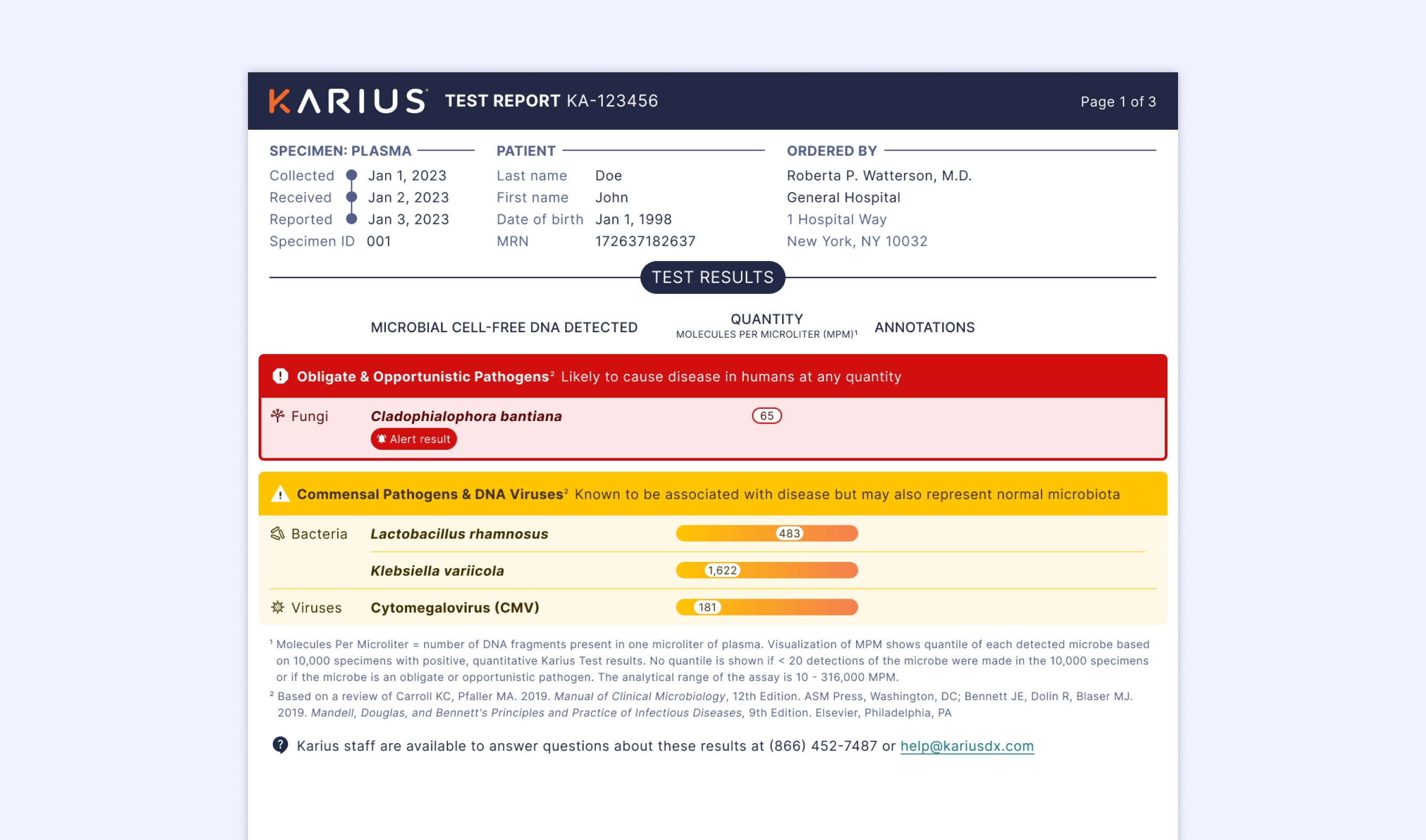
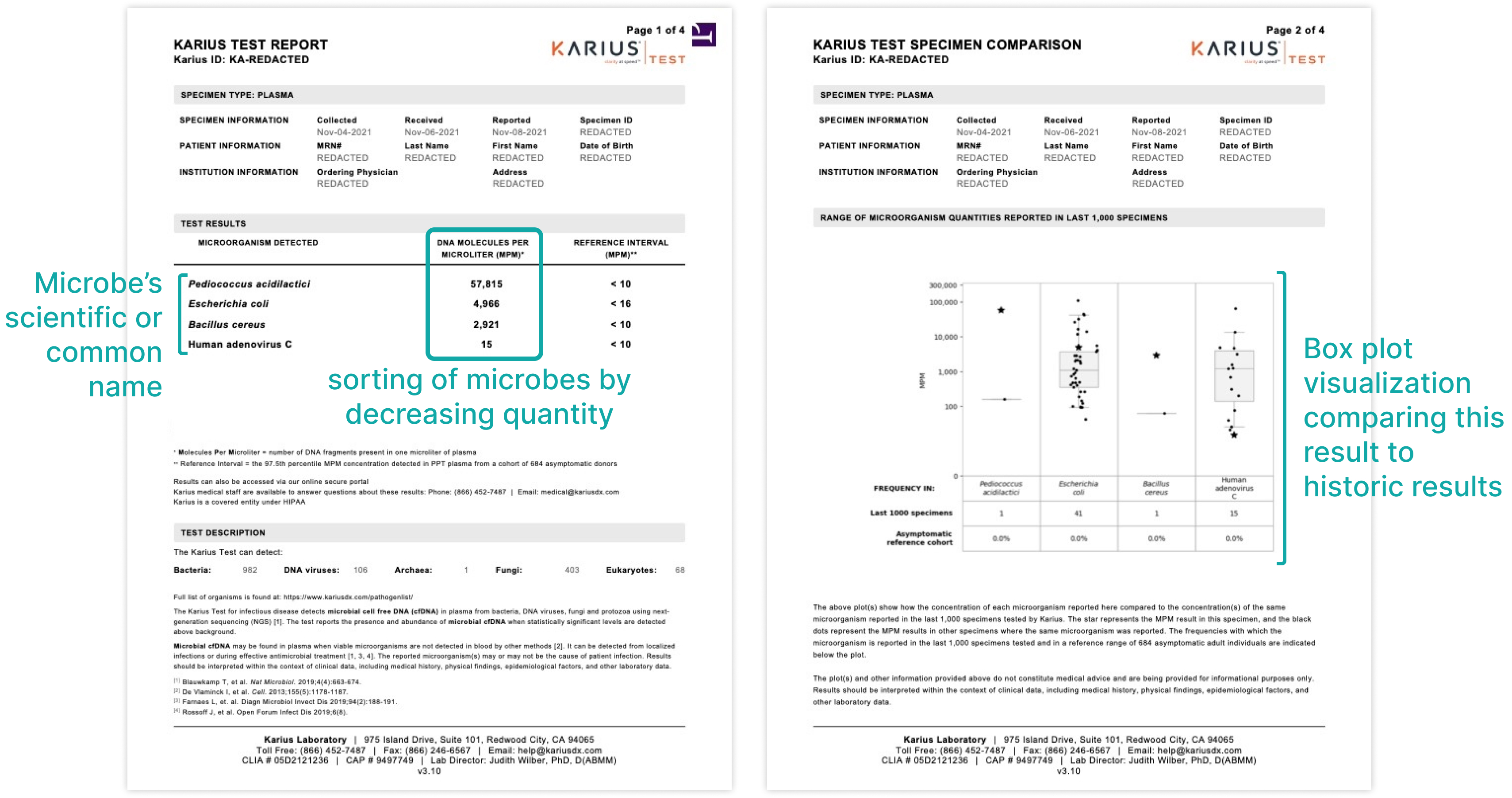
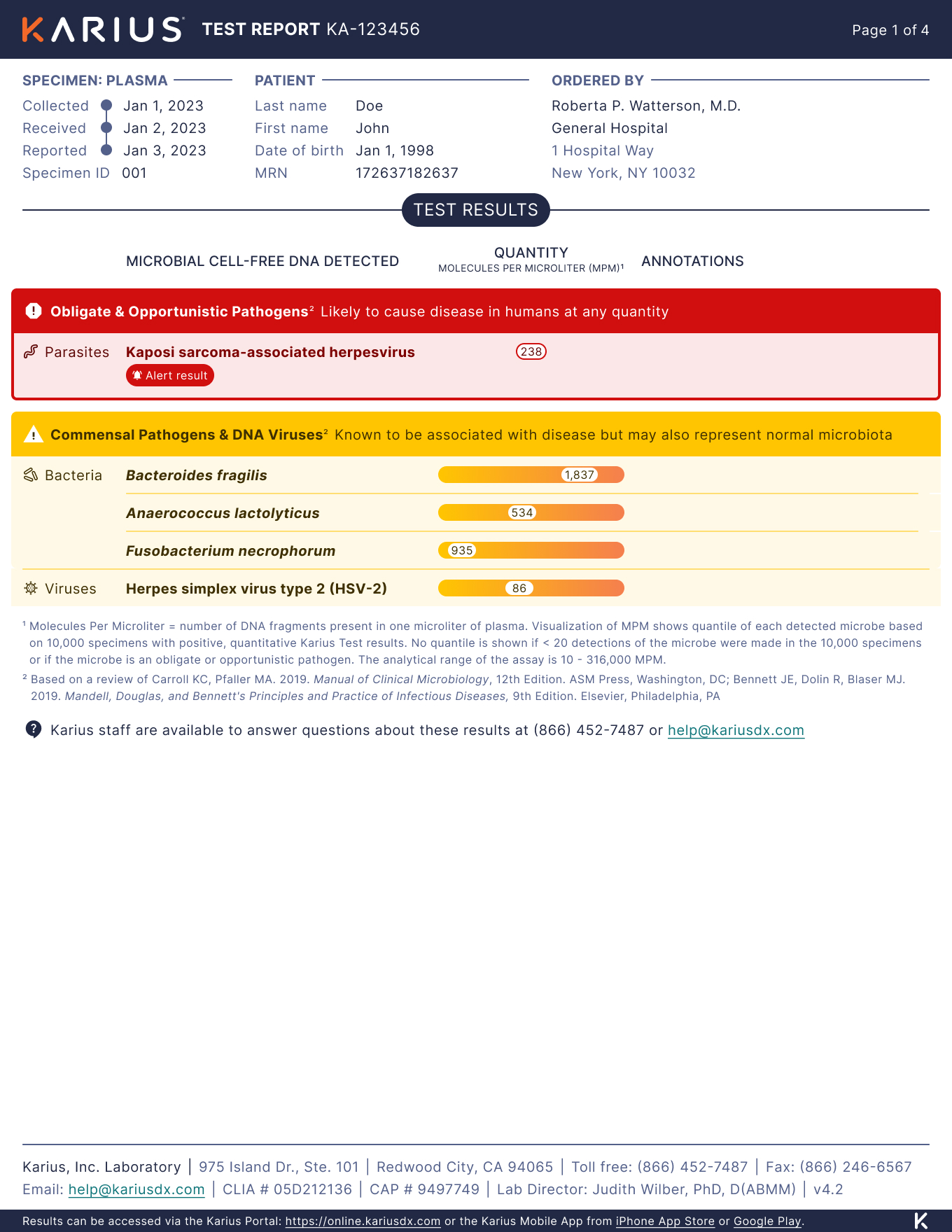
The previous positive test report
A positive result listed each microbe detected with the following information:
- The microbe's scientific name and/or common names
- the quantity of microbial cell-free DNA molecules per microliter (MPM) found in the patient’s blood
- a box plot data visualization comparing the current detection quantity to historical results
Issues with the previous report
Over the years we have gathered anecdotal evidence of the following interpretability issues from our Sales, Customer Success, and internal Medical Affairs team:
- Due to the sorting of microbes by quantity, it was implied that the microbe with the highest MPM quantity at the top of the list was most likely to be the source of infection. However the sorting was potentially misleading since MPM quantites should not be compared across microbes,
- Since MPMs are a quantity unique to the Karius Test, clinicians don't often know what it means in terms of clinical significance. There's a need for them to understand whether a quantity is relatively high or low and how that relates to the likelihood of causing disease.
- Since the box plot visualizations always appear after the first page, they were often overlooked by clinicians. Even when they were noticed, clinicians often didn't understand what the plots were conveying and how they should be used in combination with the first page results.
Design goal
The Karius Test is novel and groundbreaking technology in terms of its speed and specificty, but the test is only valuable to clinicians if they can confidently interpret results and use them to make treatment decisions for their patients.
The goal of this redesign was to empower physicians with a report that's easily interpretable so they can quickly and accurately identify what's most likely to be causing disease in their patient.
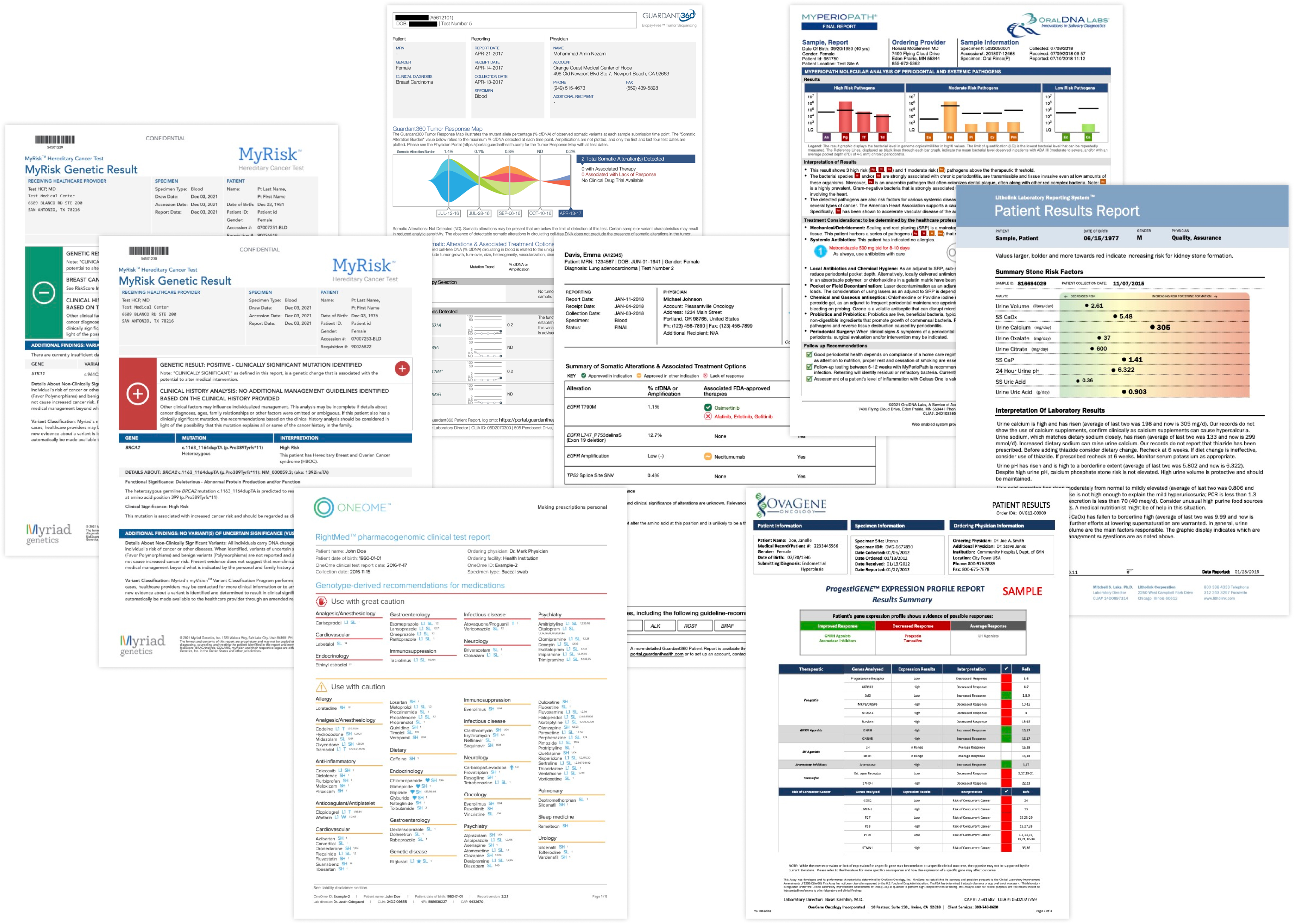
Industry audit of other reports
To kick off the design process, I wanted to get a sense for what visual and content trends physicians are familar with from other diagnostic reports and if there were best practices to follow. I audited 27 reports from 13 different companies and identified some key takeaways:
- Color and iconography are commonly used to convey severity or establish a hierarchy among multiple findings.
- Data visualizations were commonly used to help contextualize quantitative results to show progress over time or to compare a result to a patient population
Design thinking workshop
Karius has a rich spread of expertise across its different teams including lab, research, medical, sales, engineering, and marketing. Many of our employees have extensive experience in the diagnostic space as well as unique perspectives on how to represent results in our report. I brought these diverse perspectives together to generate as many ideas as possible for improved clinical interpretability.
We had a total of 9 partipants over 2 sessions and generated a variety of new ideas.
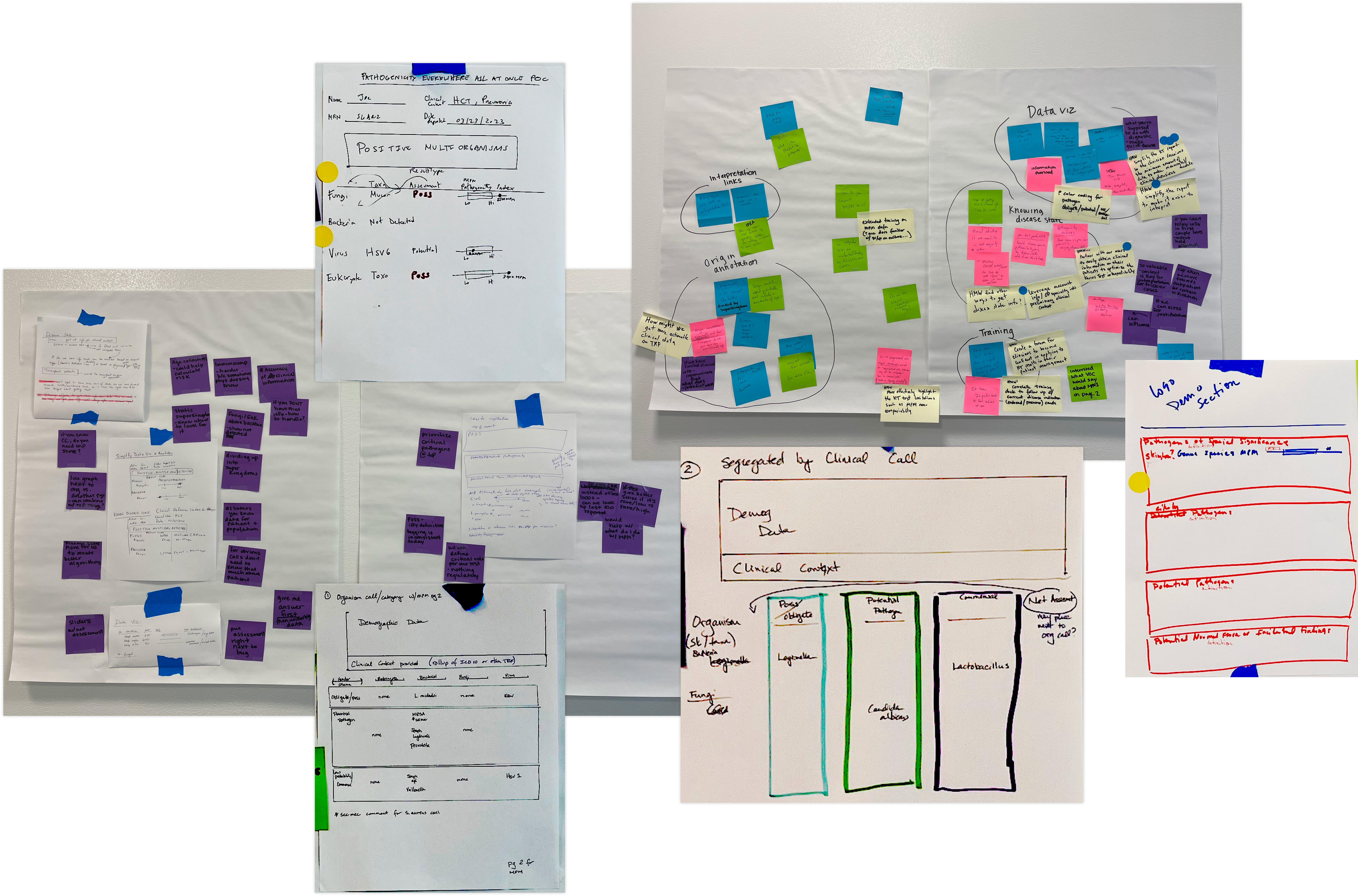
Workshop takeaways
Although each partcipant contributed something unqiue, their ideas did converge around a few solution areas:
- Rather than sorting the list of detected microbes by quantity, several workshop participants explored how might we overlay multiple levels of organization to better elevate what’s most likely to be causing disease.
- Since we know that clinicians lack context for understanding the MPM quantity and often miss visualizations after the first page, participants explored how might we integrate an MPM visualization into the primary results on the first page of the report.
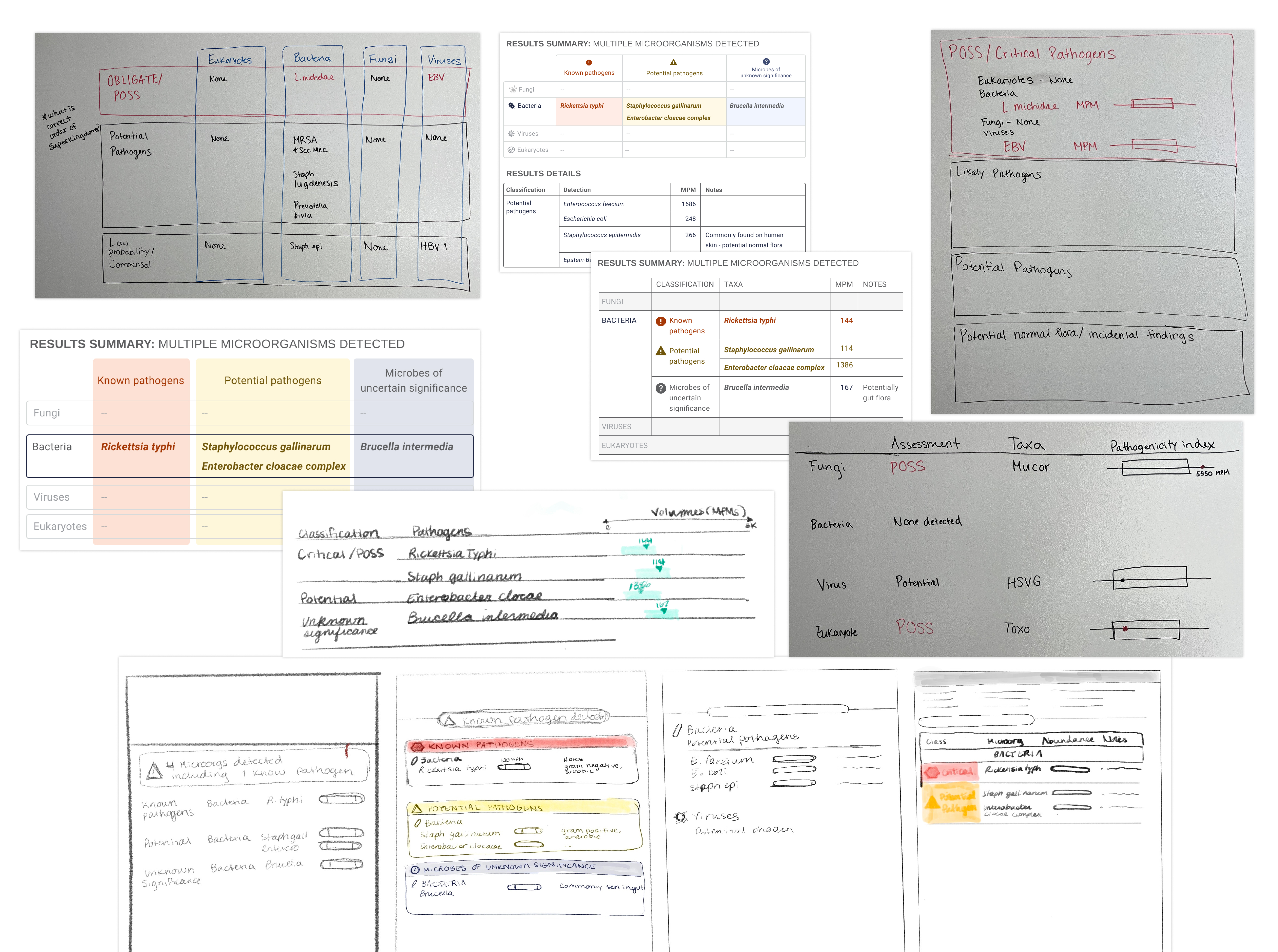
Initial design explorations
Using the output from the workshop as a creative springboard, we started brainstorming how to overlay the different layers or organization and integrate the data visuzalization into the main results' table.
Incorporating customer feedback
We did two rounds of user testing with customers to validate concepts and inform design decisions. Here were some key insights we learned from testing initial concepts:
- Customers confirmed that multiple types of categorization aided in understanding results with multiple microbes detected.
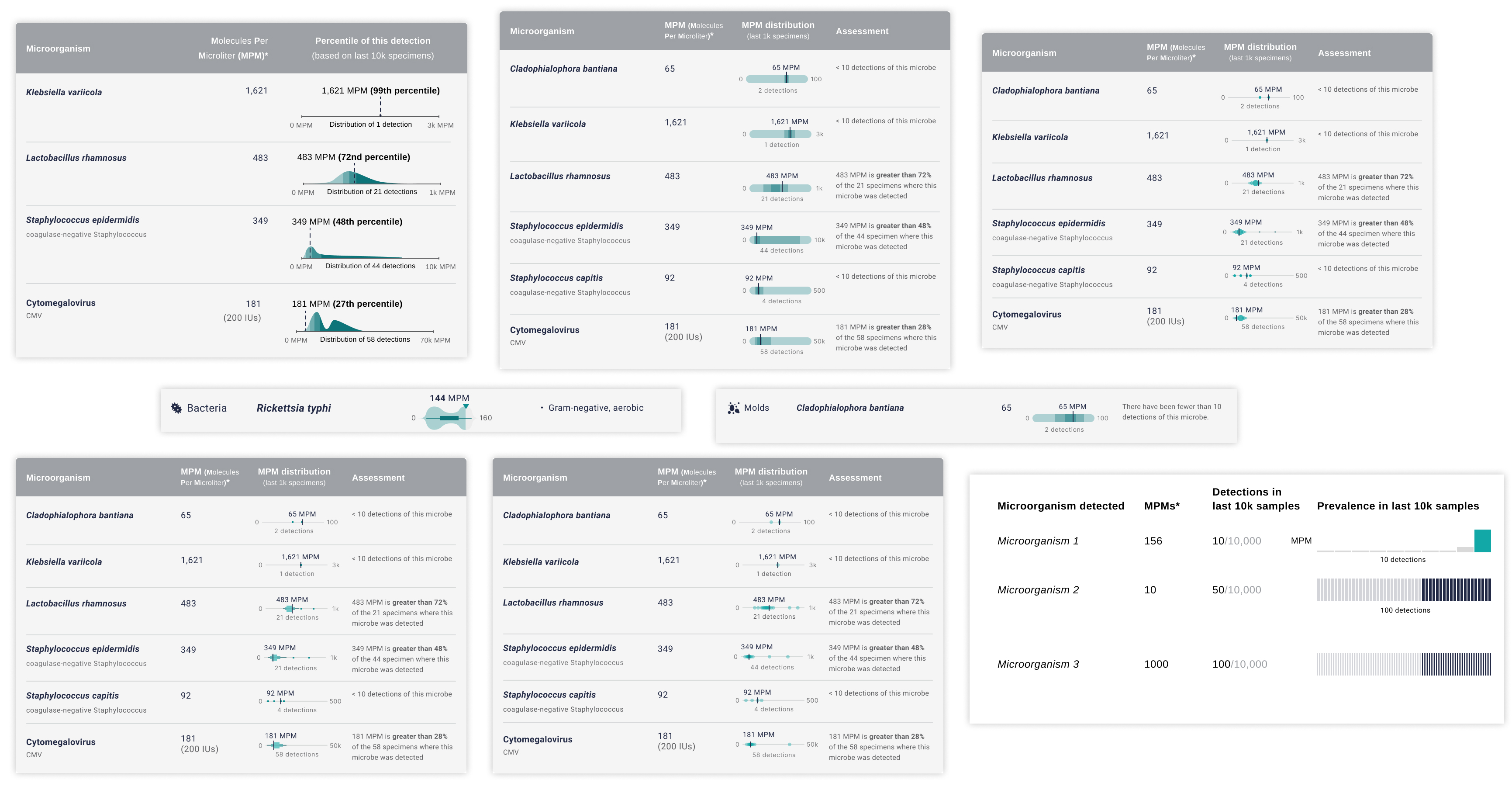
- With the new visualization concepts customers still didn't understand if an MPM quantity was relatively high or low. Therefore I needed to go back and iterate further on the MPM visualization. Here are some examples of the different plots and levels of detail I explored:
Final design
After the second round of customer research, I spent more time evolving the concepts into final designs that mitigated the known intepretability issues and scaled to fit a wide range of test results.
Dangerous pathogens get elevated, not overlooked
Our internal medical team carefully categorized each microbe in our pathogenlist so they could be separated into these color-coded categories, elevating the microbes most likely to cause disease. In this example, even though this parasite was detected at a relatively low MPM quantity, clinicians should and will be appropriately alerted to it's presence in the patient's body.
A simplified visualization to convey MPM severity
After testing multiple new data visualizations with varying complexity, the one that ultimately resonated the most was this simplified gradient, which conveys at a glance whether an MPM quantity is relatively low or high.
Superkingdom grouping
We added another new dimension of organization by grouping microbes into their superkigdom (parasites, fungi, bacteria, and viruses). Since clinicians typically treat groups of microbes (i.e. multiple bacteria) together rather than individually, grouping microbes in this way will help them make those treatment decisions faster.
Build & results
I worked closely with our engineering team throughout the development and QA process to make sure each visual detail was faithfully implemented. This was our team's first time using Figma variables in combination with DevMode which made the handoff process quite smooth and efficient.
The new report was successfully launched in Dec 2023, and is now being used to report all of our commercial results. Since the launch the early customer feedback we have received through our sales team has been positive.
As a next step, I will be doing another round of usability testing in March 2024 to identify further opportunities for improvement.