In 2021 around 2.8 million hospital admissions in the U.S. were due to infections in immunocompromised patients. The standard of care includes invasive, diagnostic tests that can cause complications for the patient, take too long to produce a result, or can sometimes fail to identify the causative pathogen.
As an alternative, The Karius Test is a liquid biopsy for infectious diseases that can rapidly and non-invasively detect over 1,000 pathogens in a small sample of blood.
Karius Internal Tools
Lead Product Designer
Redesigned the internal software tools that enable our teams to receive patient samples, process orders, and deliver critical patient results to physicians
The need for the Karius Test
How does it work?
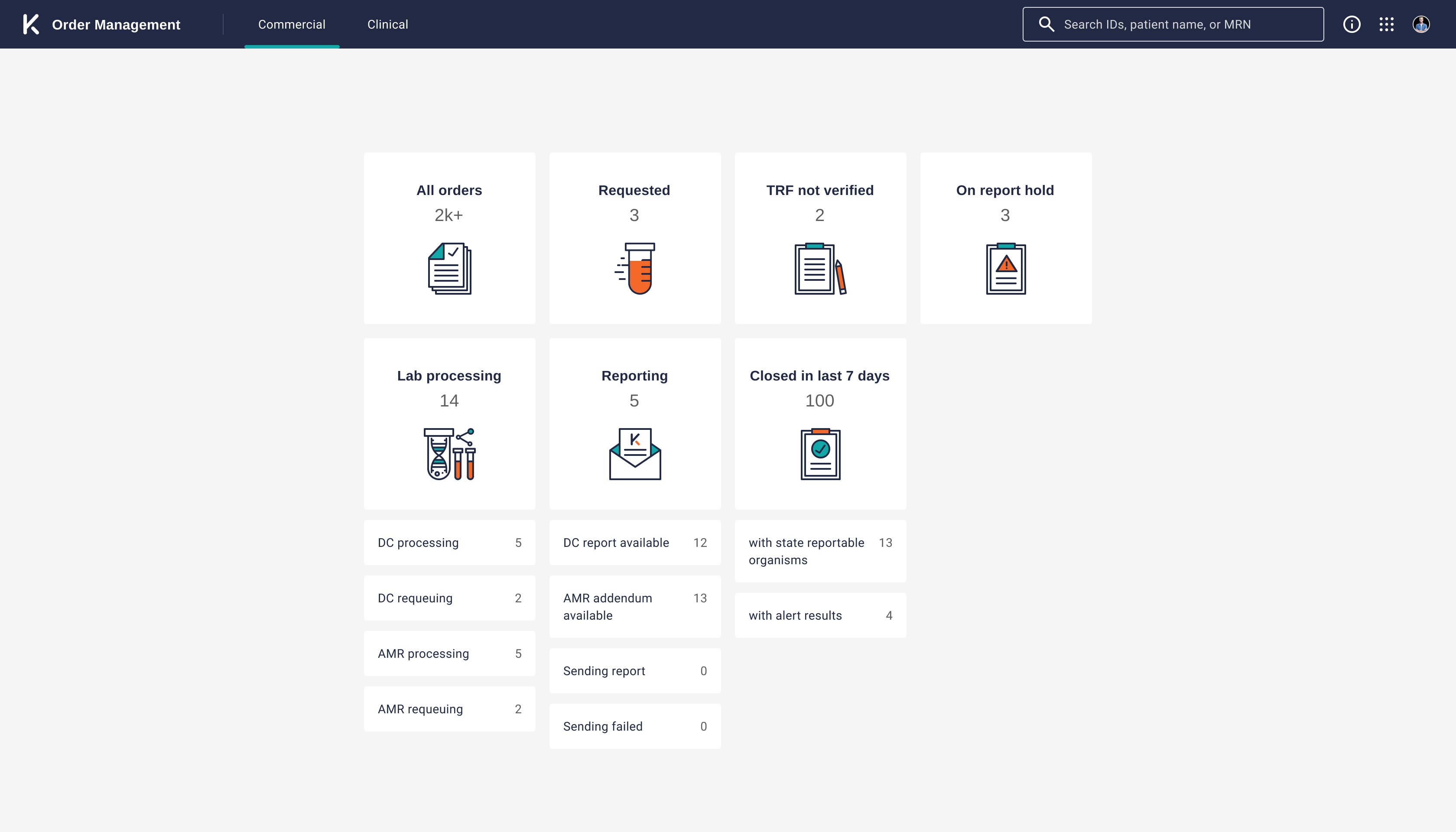
When a physician suspects an infection in their patient, they will order a Karius Test by sending a sample of the patient's blood, and once Karius' lab has processed the sample, they will receive a report with a result about 24 hours later.
The problem
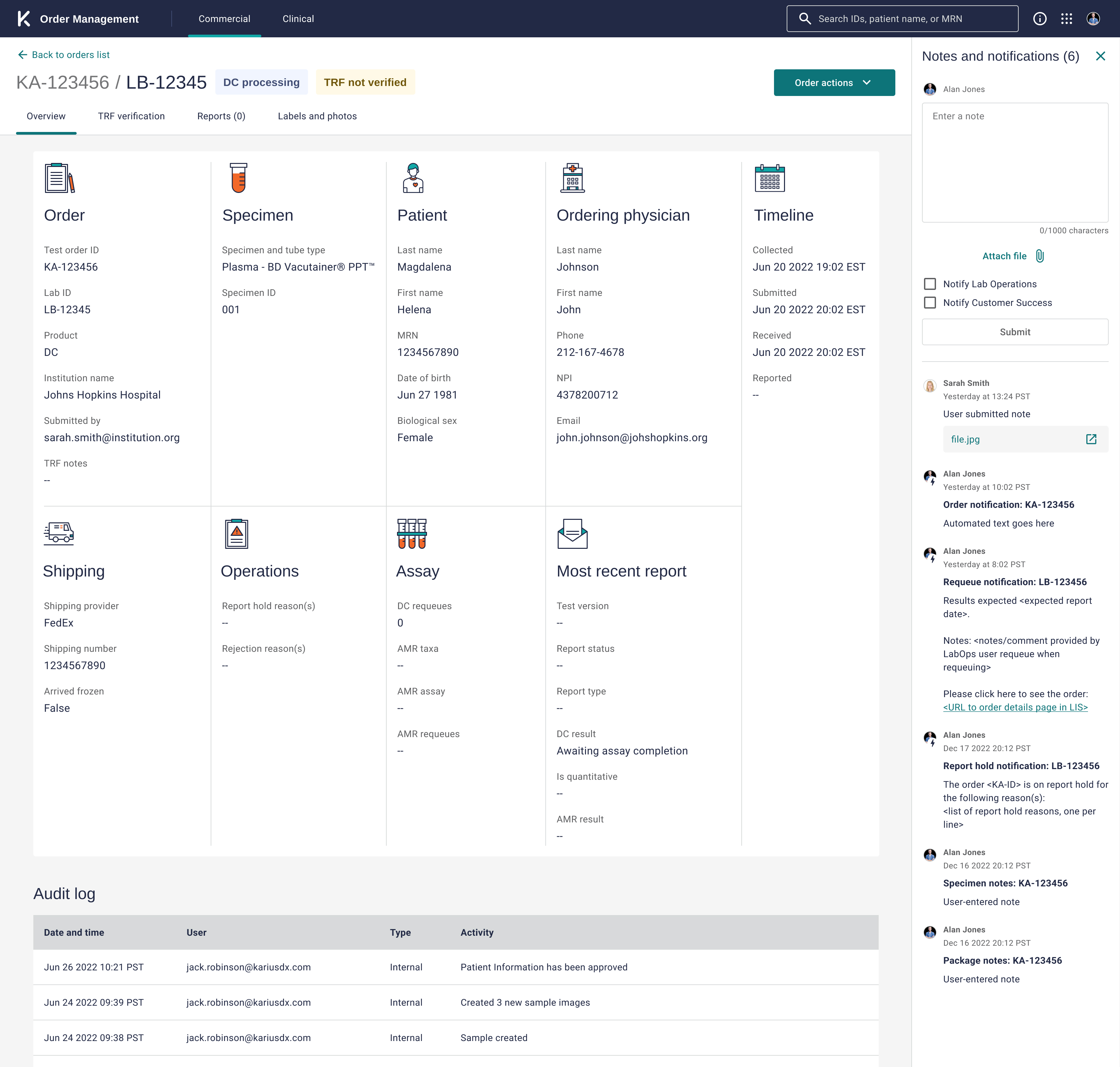
In order to complete the process above, Karius' internal Lab Operations (LapOps) and Customer Success (CS) teams were previously relying on a legacy lab information system (LIS) that had barely been updated since it launched in 2015. The old LIS system was built when Karius was receiving <100 orders a month - as of Jan 2024, we now receive ~1,600 samples per month. As Karius continues to scale, it is critical for our internal operations teams to be able to keep pace with the increasing sample demand to maintain the value of Karius's rapid turnaround time.
At the same time the tech stack of the old LIS system was becoming very difficult to maintain and update. This presented us with the opportunity to rebuild the system from scratch with a focus on usability and scalability.
Design goals
My role as a Product Designer in this project was to hit two main objectives:
- 🚀 Create new internal operations tools to empower our Lab Operations and Customer Success teams to efficiently and accurately process all orders
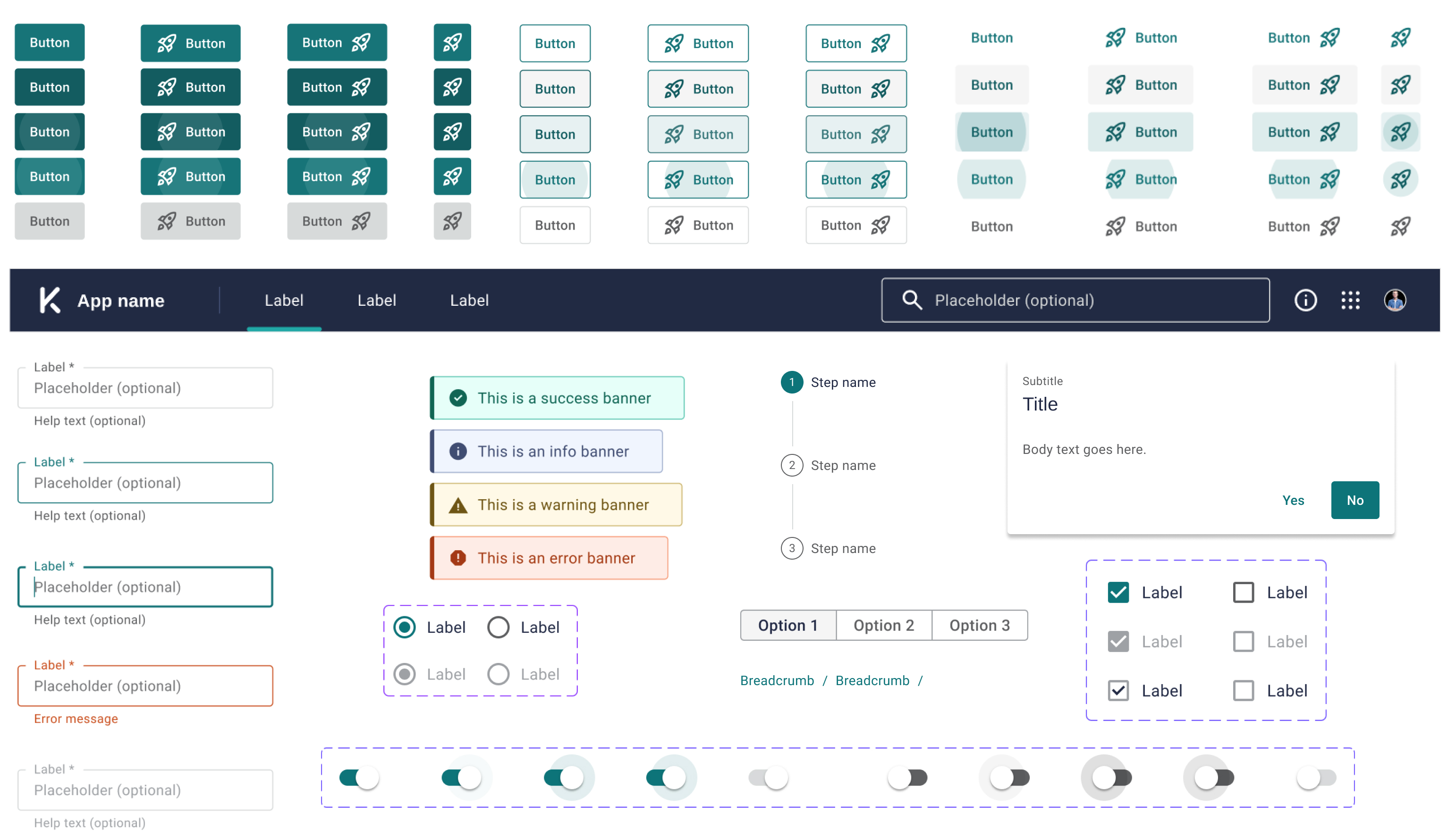
- 🛠 Design for consistency and scale by using reusable components to simplify changes, reducing design and technical debt
Discovery
I started this project shortly after joining Karius, which meant I had to rapidly familiarize myself with the LabOps and CS teams' current workflows and processes. I knew that by developing a deep understanding of how these teams worked both independently and collaboratively was an essential first step in identifying opportunities for improvement.
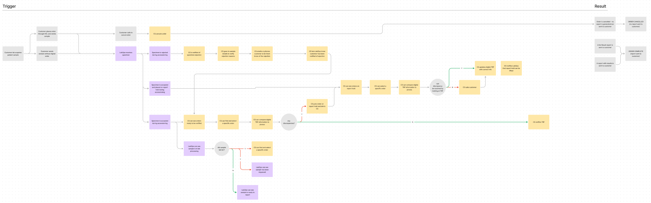
I partnered with our UX research intern to shadow and contextually interview members of the LabOps and CS teams while they completed their daily tasks. Through this process I was able to create workflow diagrams to better under their current paint points and process gaps.
Discovery takeaways
After many hours observing and interviewing these teams, we identified the following key areas as opportunities for improvement:
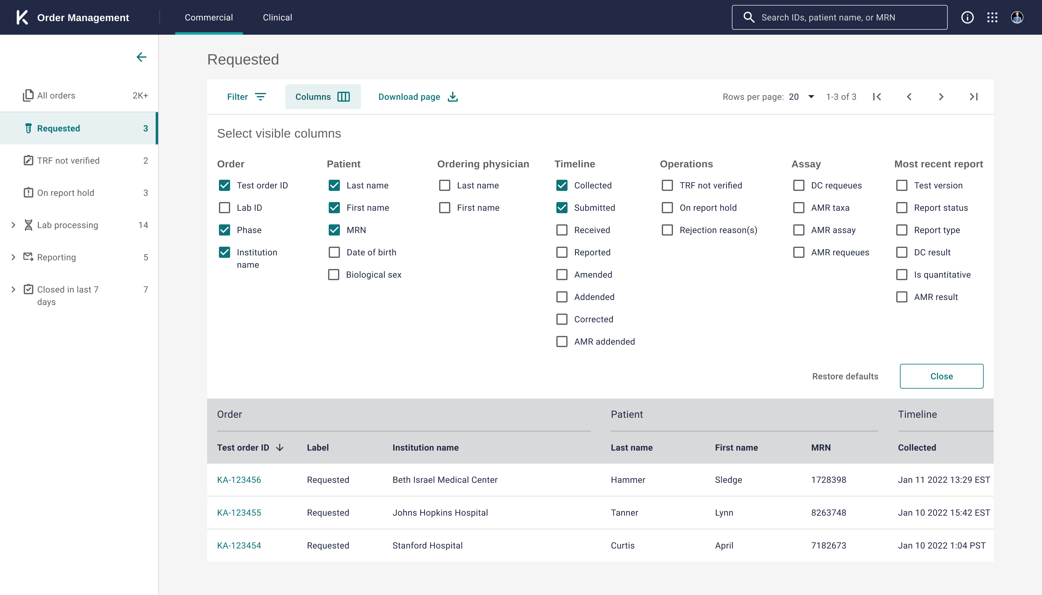
- Although both teams were using a single LIS system, their usage of this monolithic app was actually quite segmented. There was therefore an opportunity to reduce each team's cognitive load by breaking apart this one system into task-focused apps.
- There were multiple points in LabOps and CS' itersecting workflows that required one team to manually notify the other of an issue or action item. Each of these manual notifications were costing teams time and introducing the risk of human error. We knew it would be important to automate these notifications when possible.
- During contextual inquiries, I observed redundant steps in users' workflows simply due to layouts and realized some page hierarchy optimization would be an easy way to improve task effeciency.
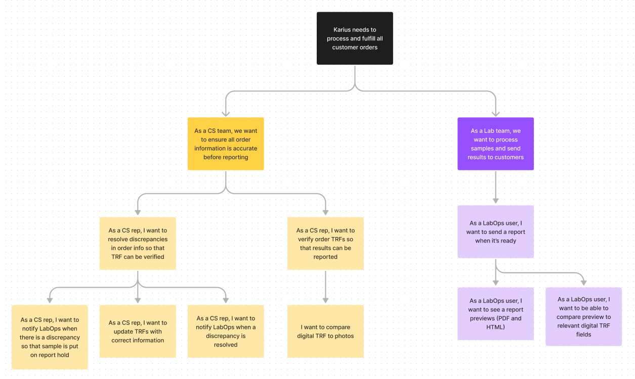
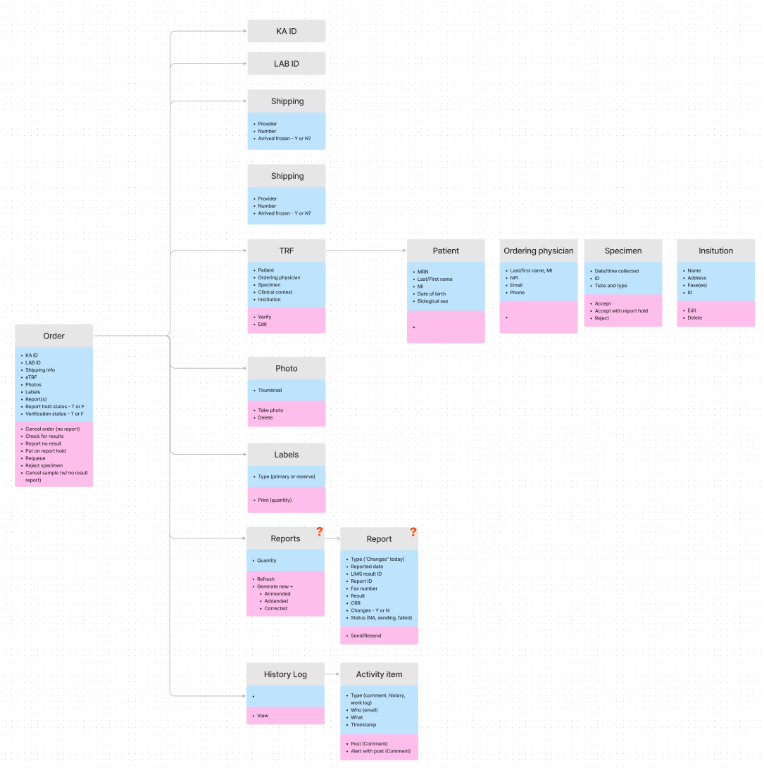
User stories and new workflows
I then spent time with my Product Manager mapping out a hierarchy of user stories based on what we had learned about users needs. I used these stories to map out improved workflows and the object model needed to support these tasks. I like to do task object modeling before sketching out any screens to better understand the the relationships that will need to be reflected in an app's information architecture.