Businesses buy Hoopla to create customized TV channels to broadcast around their offices. The original Hoopla TV displays were modeled after the broadcasting graphics that were current at the time but have since become quite outdated. We needed to ensure that Hoopla remains exciting, engaging, and representative of what TV graphics look like today.
Hoopla TV Refresh
Visual Design, Branding
Hoopla TV was orginally designed to emulate sports broadcasting graphics from the early 2000s. Since the TV experience is the highlight of Hoopla, we decided to freshen up the look and feel.
The problem
TV graphics 101
To optimize Hoopla's 10-ft, big screen experience I spent some time analyzing graphics from various sports and news broadcasting networks.
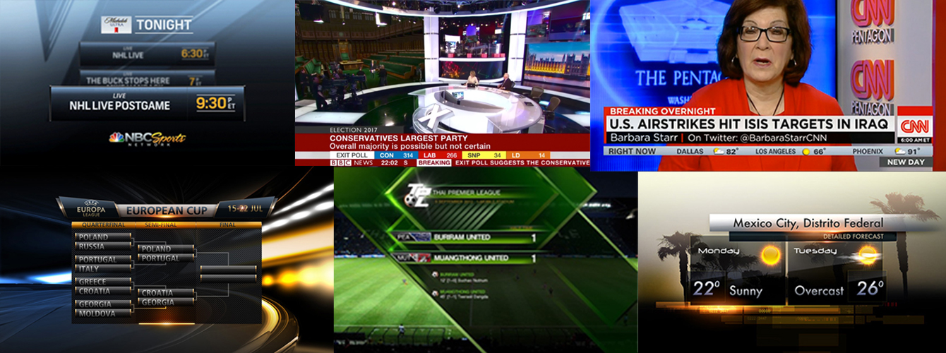
After researching a wide spread of broadcasting graphics, I identified pervading visual trends:
- Contrast - Since TV screens are 50% brighter than computers, there must be greater contrast and larger fonts for readable text. No two colors with the same brightness value should be layered.
- Less is more - Textual content must be broken up into small, digestable chunks and introduced gradually.
- Motion - Essential to having the appearance of live TV and not a screensaver.
- Depth - Make sure elements overlap and cast shadows to create a sense of depth and space.
Points of focus
I arrived at the following points of focus:
- Typography - The previously used font (DINPro) was selected to match ESPN in the early 2000s. I focused on exploring fonts which were consistent with the Hoopla brand personality, but also could remind our customers of typography they see on live networks today. I settled on Gibson, a sans-serif font which is both readable and current. My competitive analysis revealed a trend towards rounder and stronger weight fonts like Gibson. Gibson also has a generous x-height in proportion to its capital letters, which greatly imroved readability from a distance.
- Color - The previous Hoopla TV used some random colors, so I took the opportunity to integrate colors from our actual branding style guide. This helped create a greater sense of visual unity between our TV and web experiences.
- Framing - I created a system of frame assets to use behind all of the textual displays. I carefully selected an opacity that would provide enough contrast for readable without completely obscure the customized backgrounds.
- Animation - Rather than have elements and screens fade into one another, I looked for more dynamic ways we could phase assets in and out of focus.
Final designs
Below you can see a side-by-side comparison of the previous TV designs and the refreshed and current visuals.
Previous
Refresh
Future iterations
For speedy delivery of an MVP, we released a visual "facelift" with minimal changes to the underlying layout and HTML. If given the opportunity to make more extensive enhancements to the TV experience, there are still a few areas where I see room for improvement:
- Use of 3D Space - We did scratch the surface with some new 3D animations, but I would like to push farther and introduce 3D shapes and text as well.
- Transitions and animation - For now many transitions rely on simple fades, so I would like to diversify our animation set.