Previously, prospects and customers had to contact us to handle any purchasing or billing needs. We needed to address several points of friction to make it easy for customers to subscribe and renew their accounts.
Hoopla Billing
UX Design, Visual Design
Redesigned the intial purchase, subscription upgrade, and adding licenses flows.
The problem
Business requirements and user needs
I began by wrapping my head around the business-level requirements:
- Purchase from free trial
- Upgrade their subscription edition
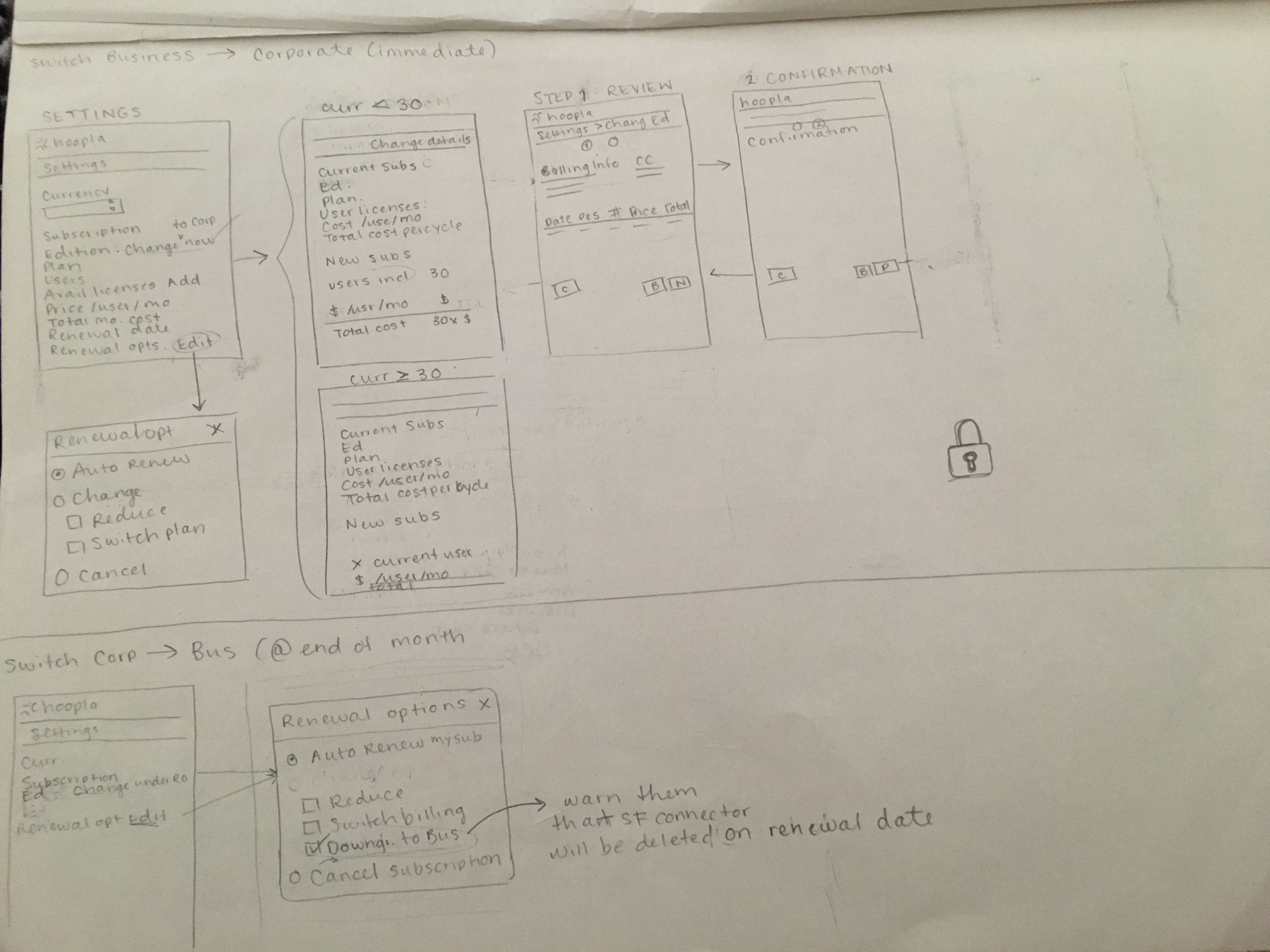
- Renew their subscription
- Cancel their subscription
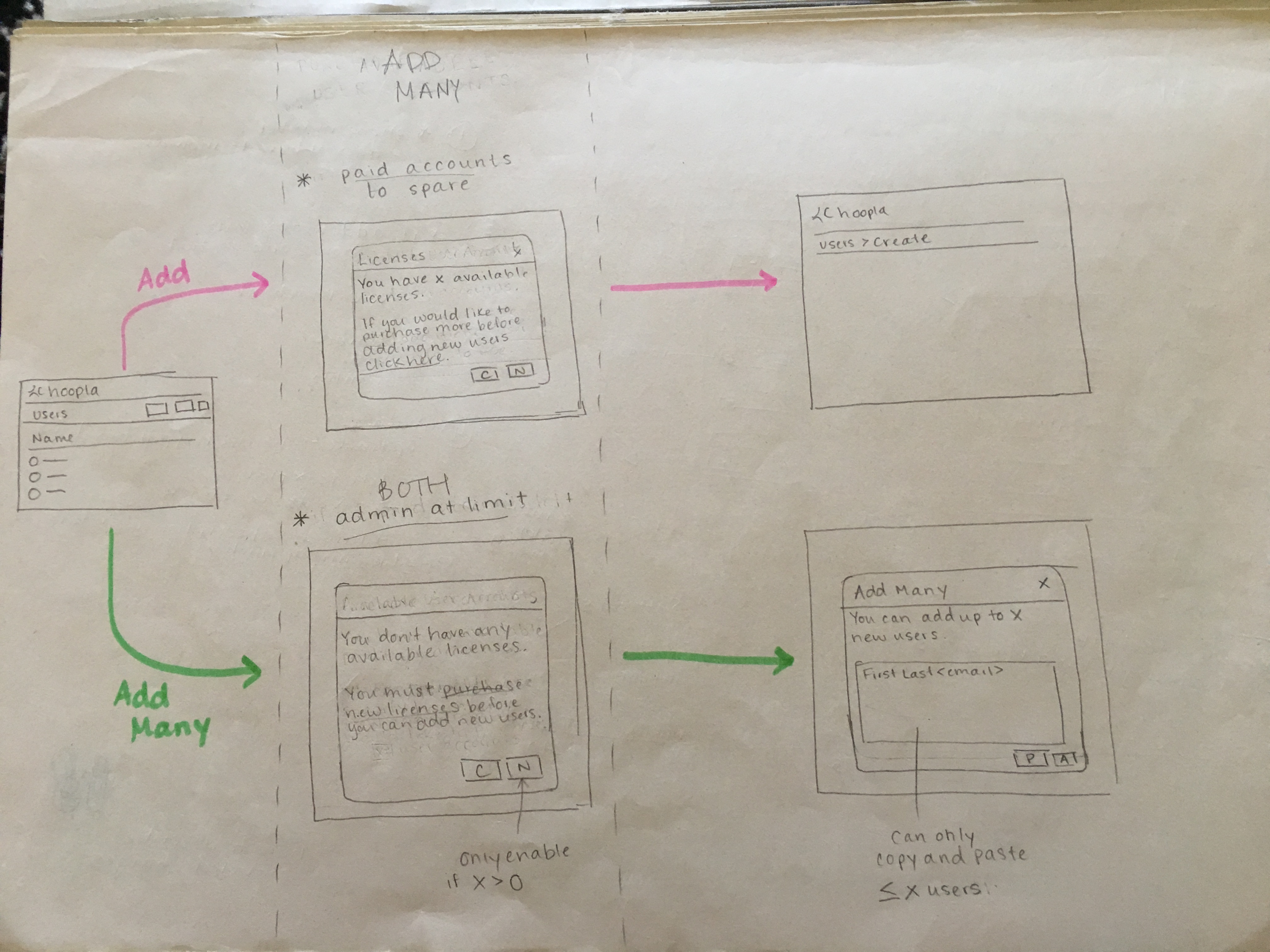
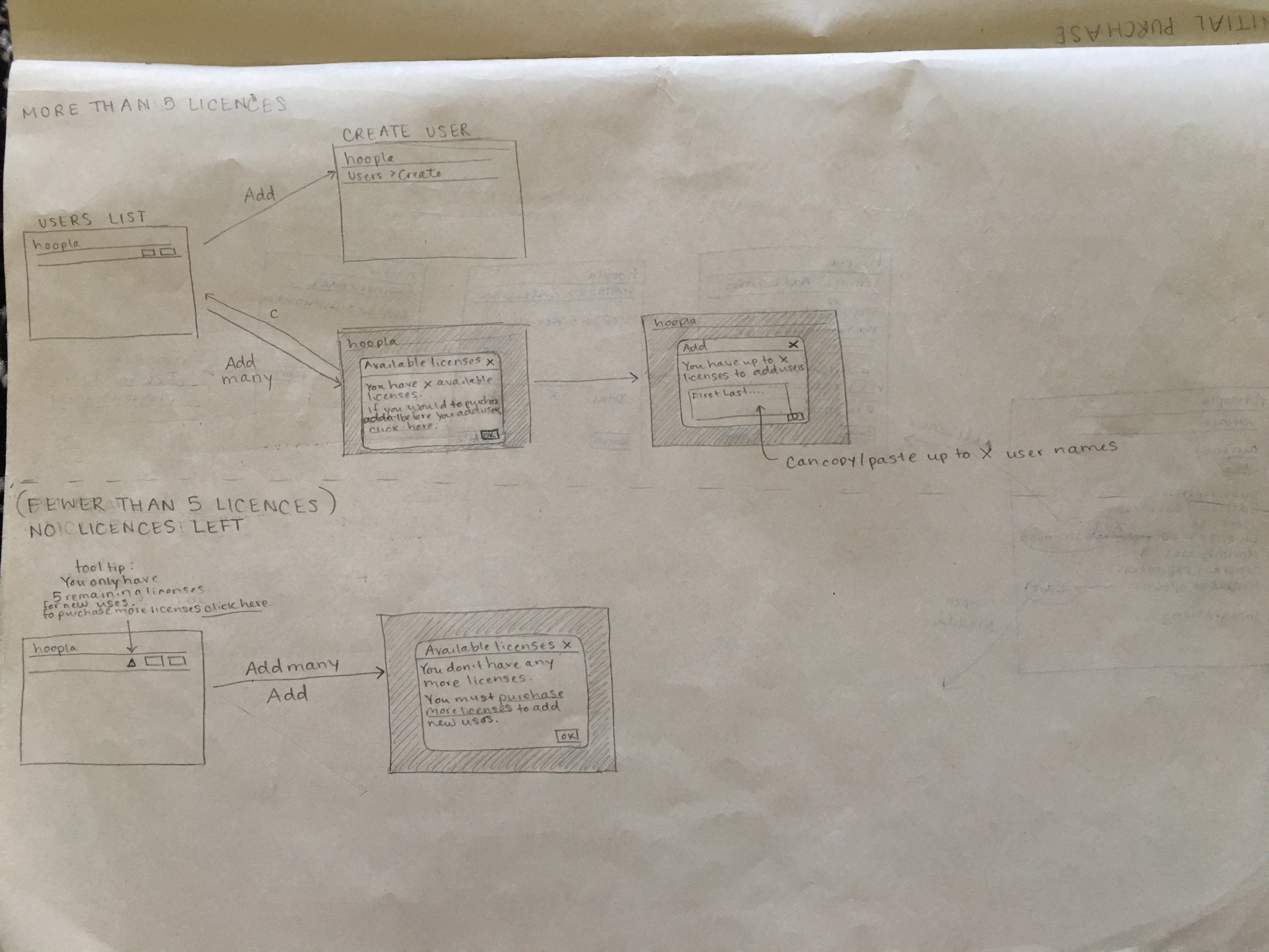
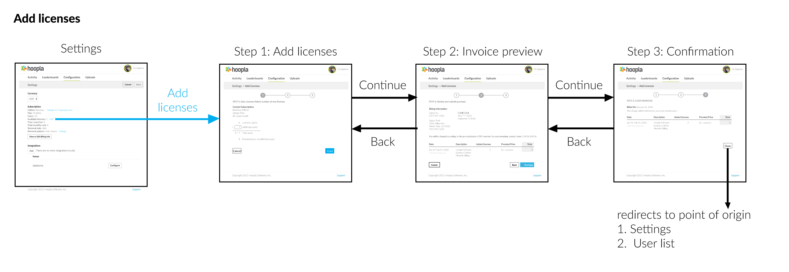
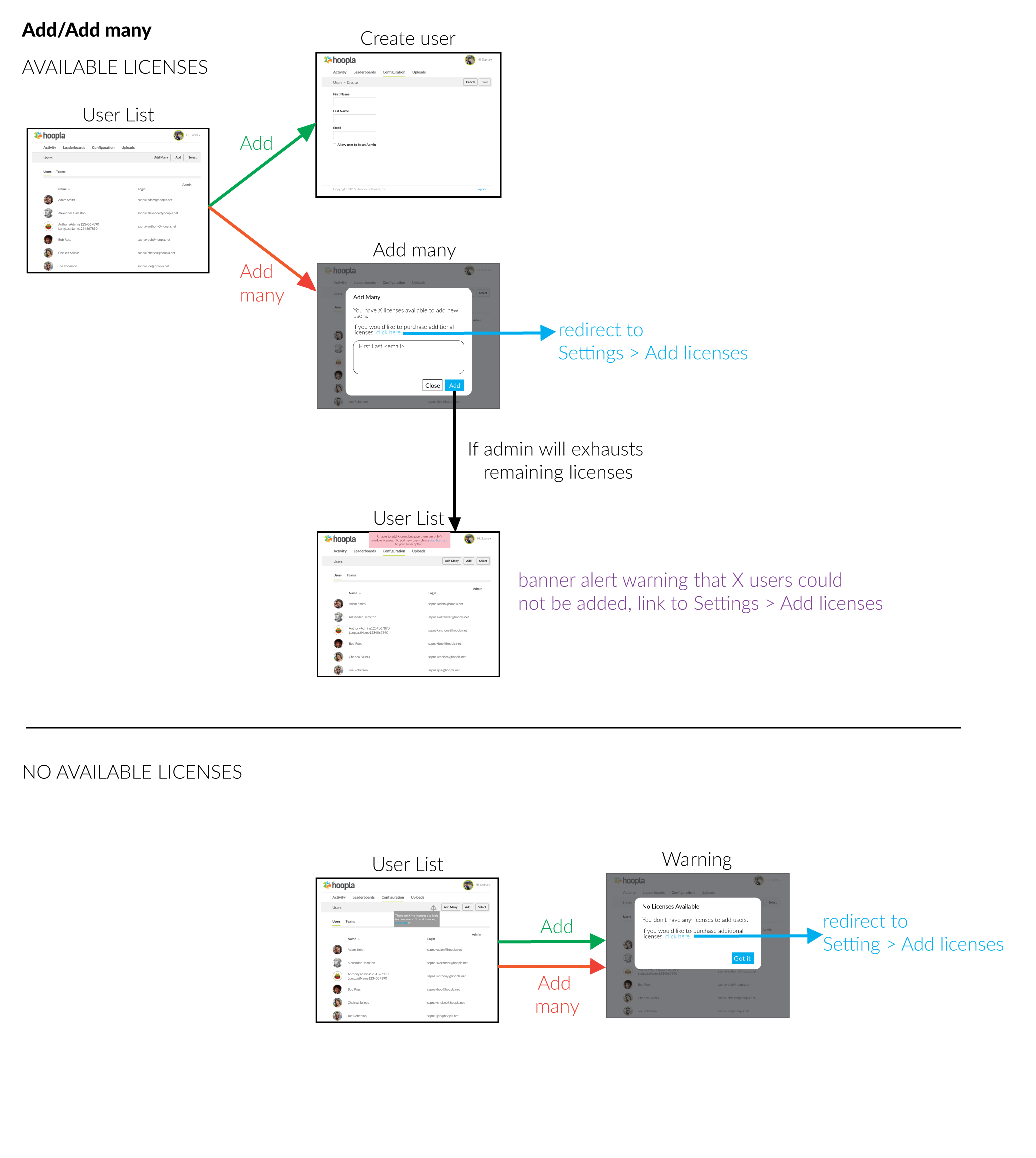
- Purchase licenses for new users
Constraints
There were a few business requirements and resource constraints which I had to consider and work within:
- No custom invoicing - we did not have the resources to build out a custom invoicing system, so customers would still be receiving Recurly invoices.
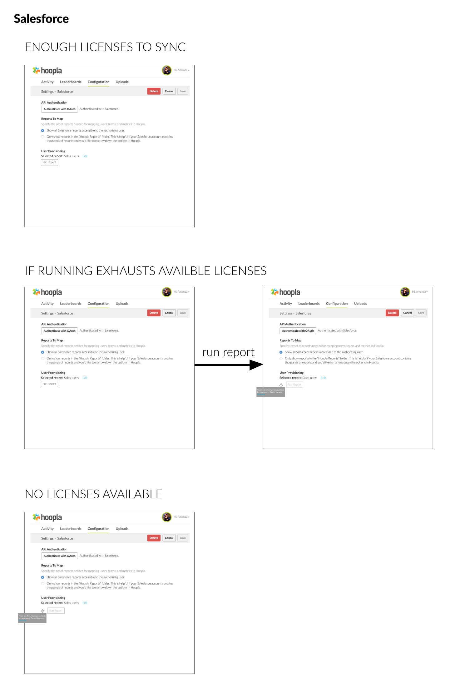
- Enforcing a user minimum - While it frustrates many of our smaller customers, we must continue to impose a minimum user of licenses when purchasing.
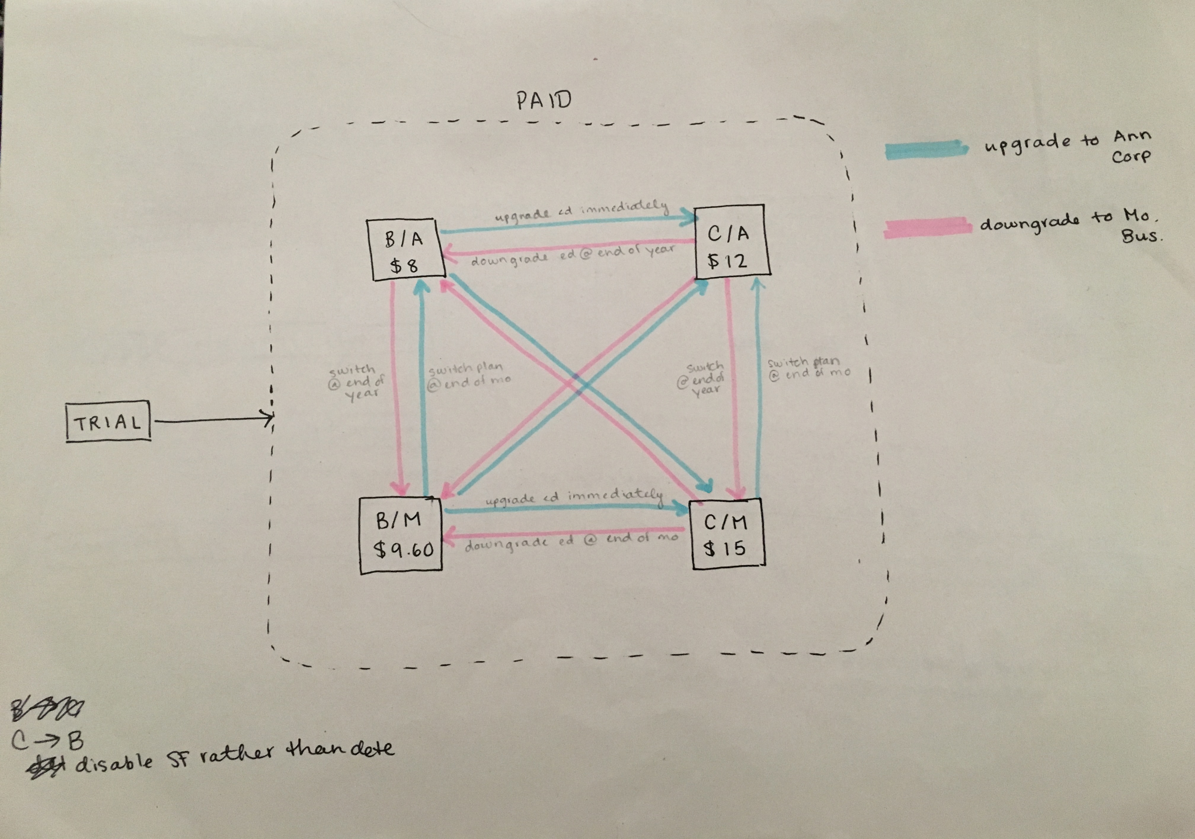
Scope analysis
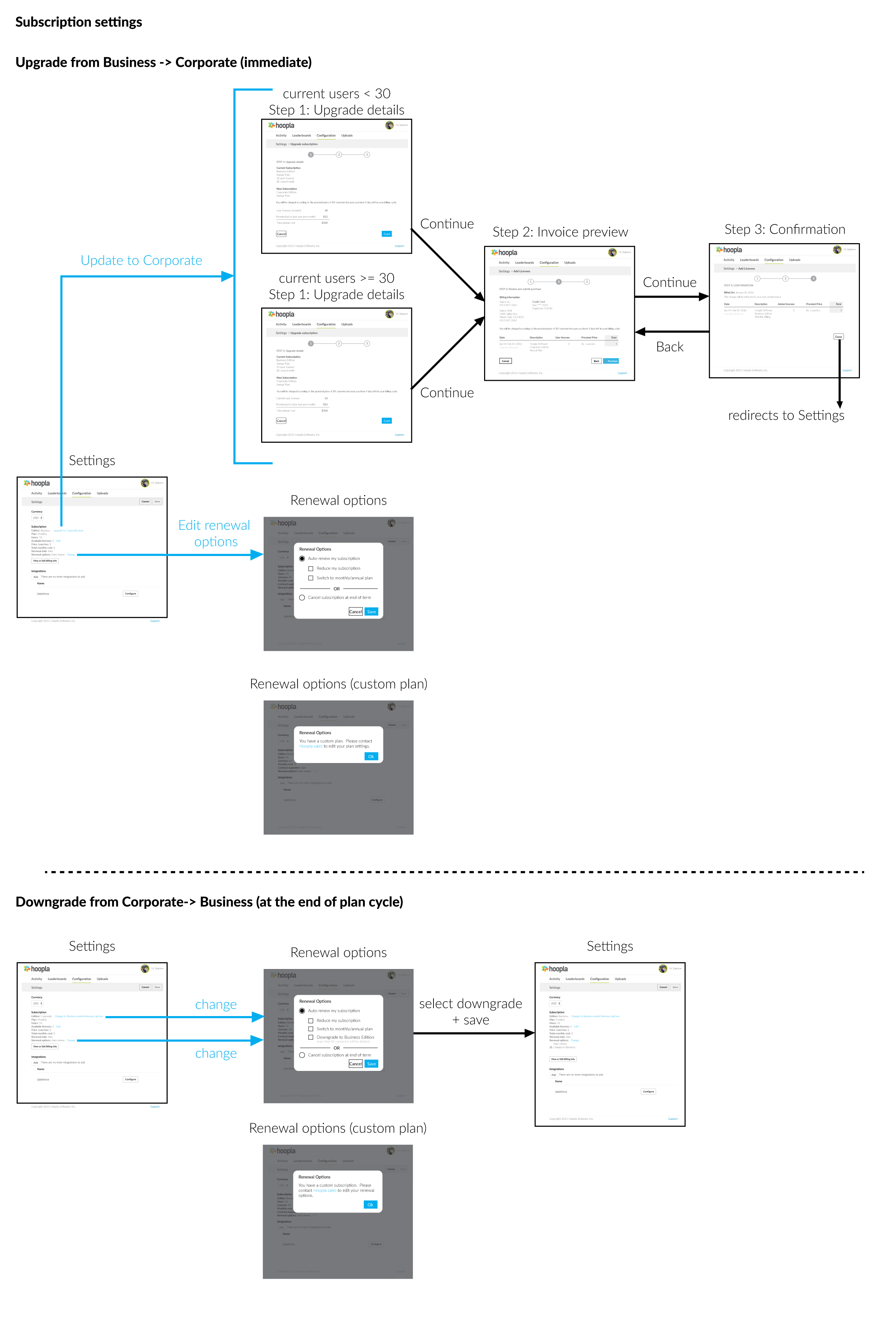
From our business requirements I charted out all the potential "states" of an account to better understand the full scope of user flows we would need to address:
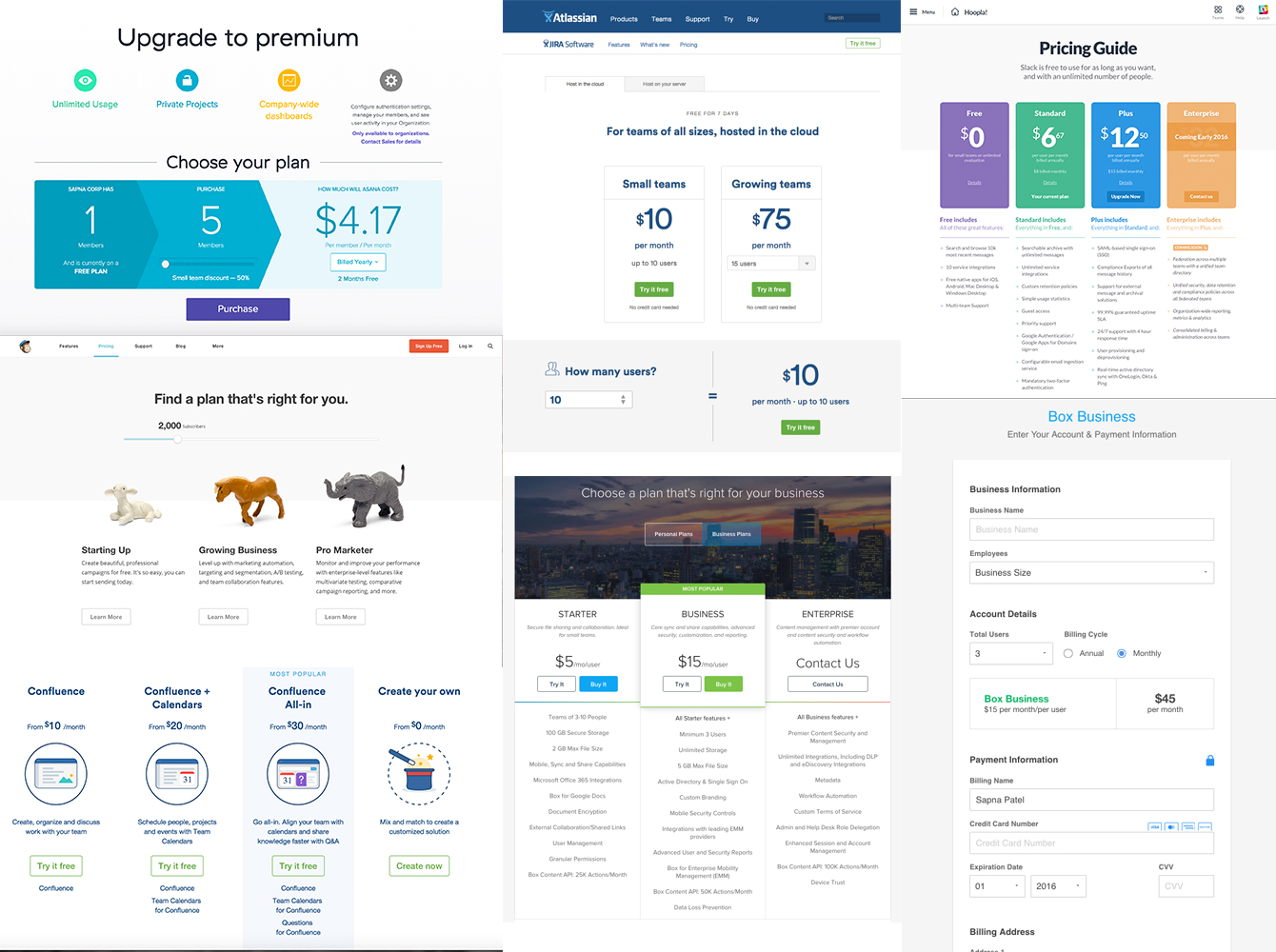
Competitive analysis
I then began by comparing the purchasing and checkout flows of other leading SaaS products. I wanted to understand how they had addressed the same business needs and what other user needs they had identified.
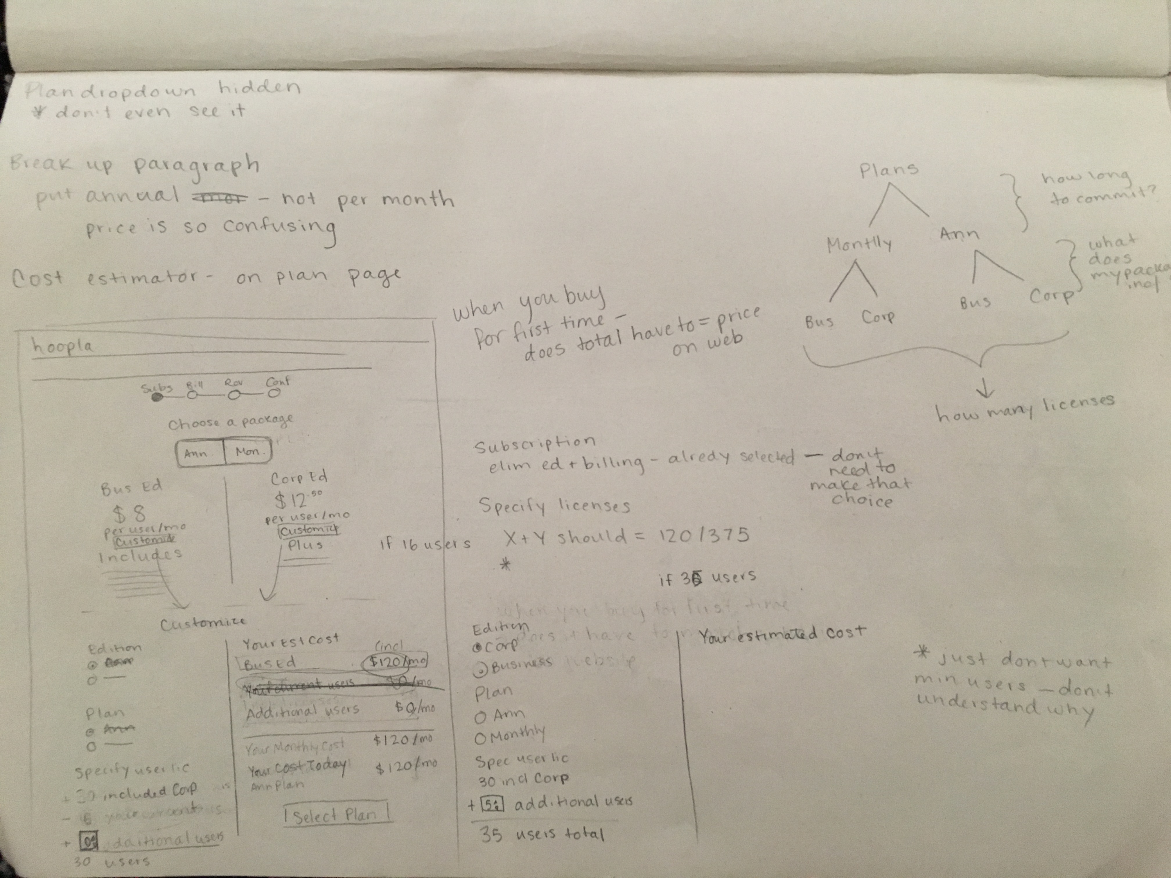
Sketches and user flows
From the trends I observed in other SaaS apps, I began drafting user flows and rough sketches of specific pages.
Wireframes
I then drafted rough wireframes of the proposed flows to vet internally. Our Sales team and Customer Success Managers provided helpful feedback based on their experiences dealing with customers' purchasing needs. I also presented the wireframes to developers to ensure compatability with the backend design.
Hi-fi mockups and user flows
Below are a few of the completed mockups. You can also check out the complete user flows in hi-res.
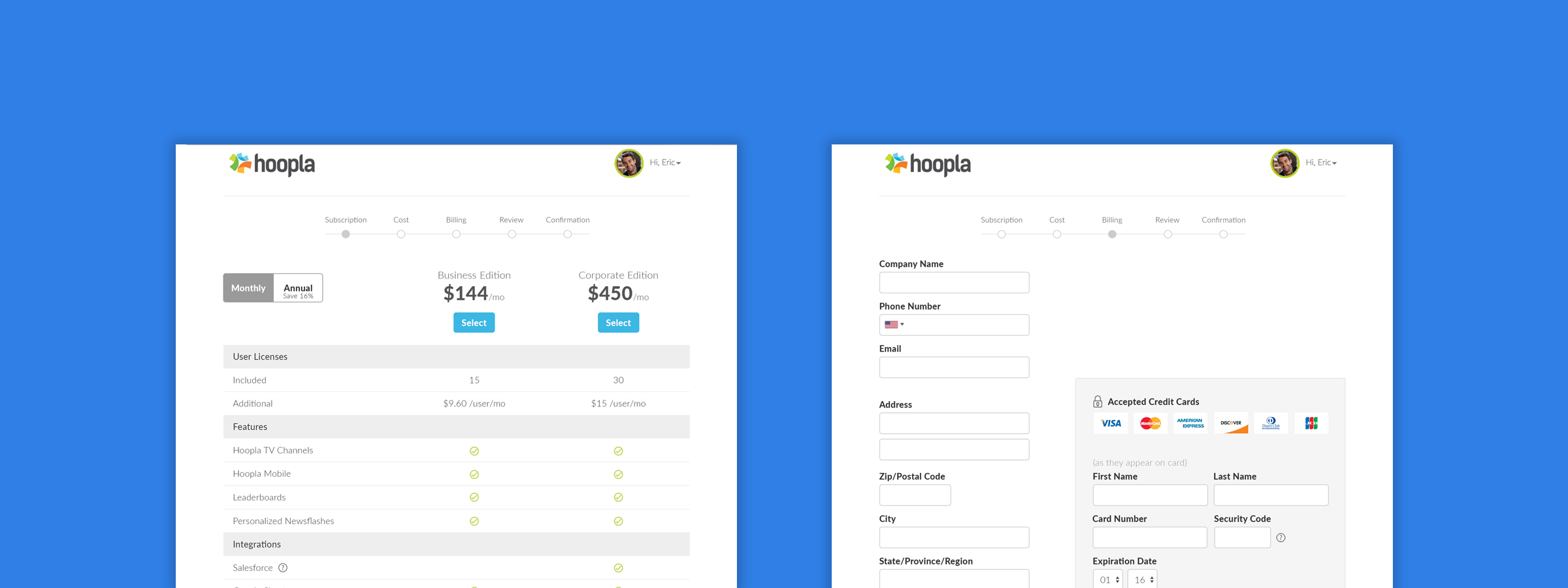
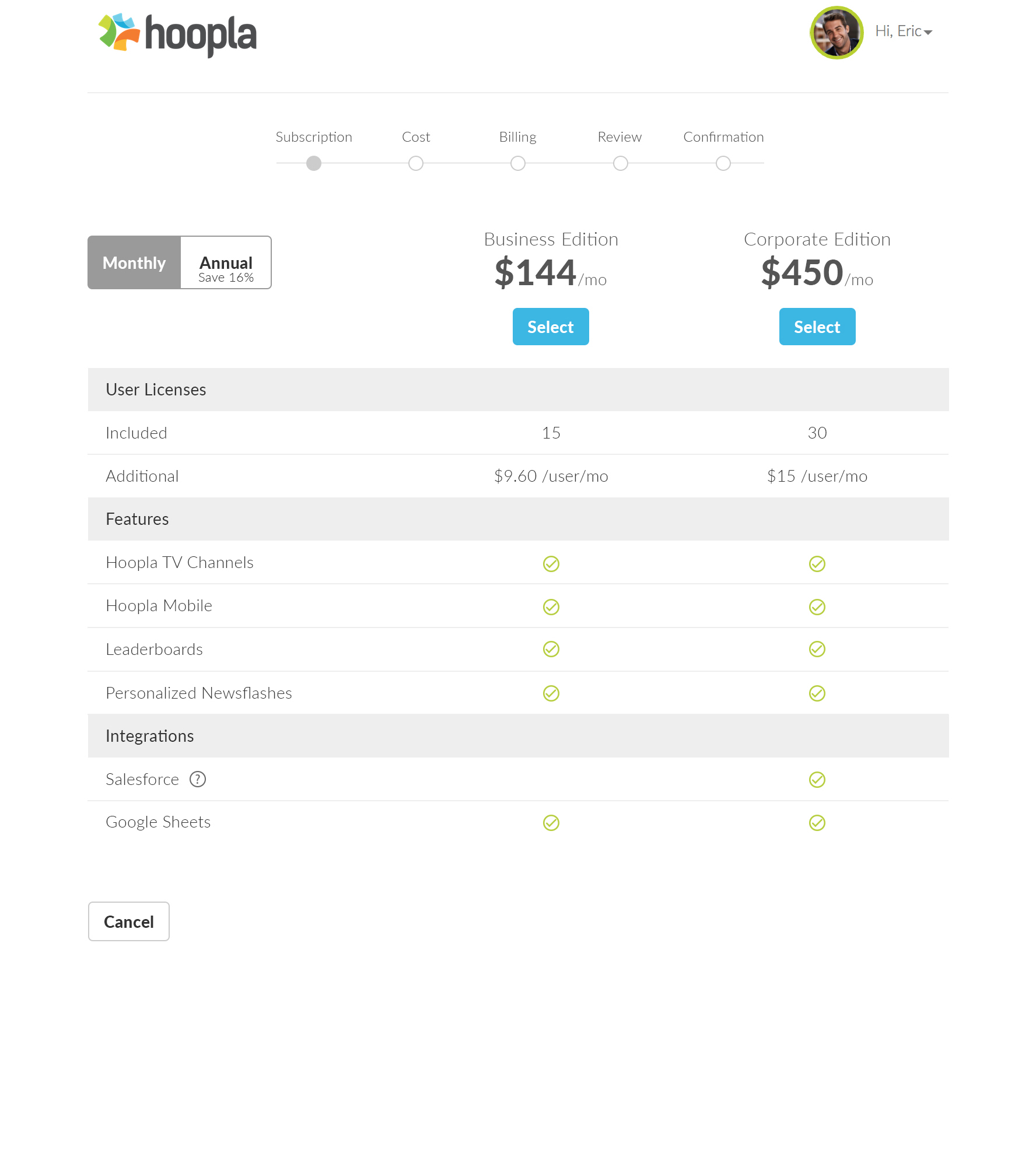
Pricing page
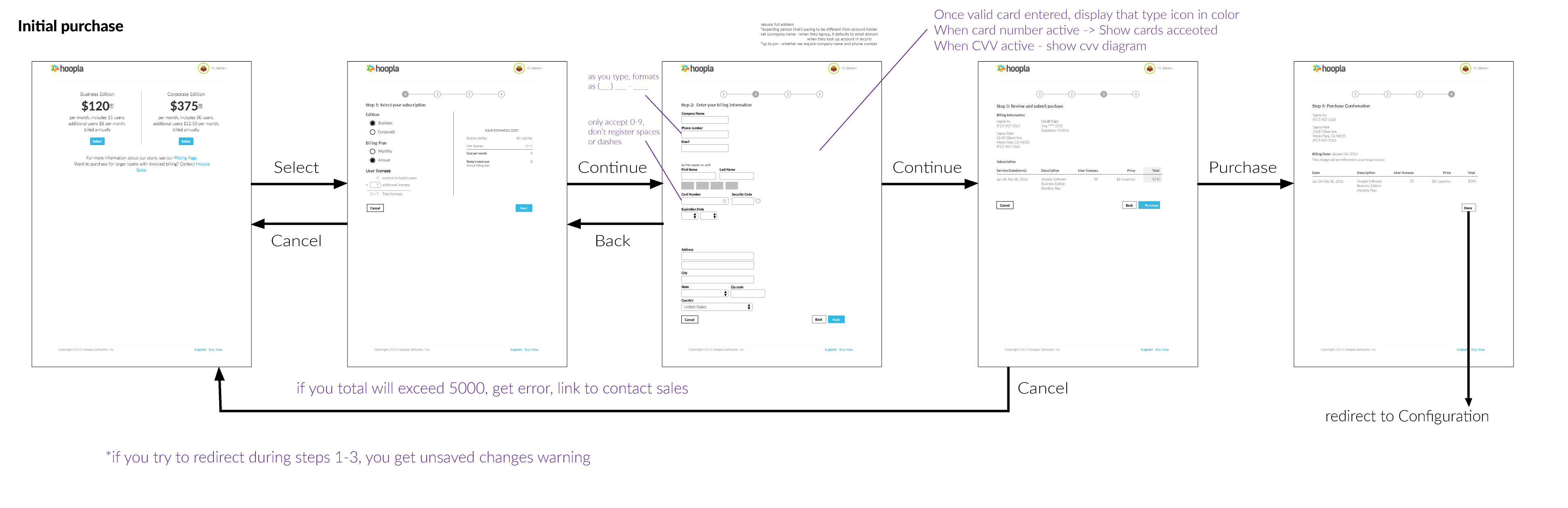
Although an update to our pricing page wasn't given as an initial requirement, I recommended a redesign following my competitive analysis. It became clear to me that transparency and clarity are of paramount importance, especially when a pricing model has multiple dimensions to consider. This page had to convey that their are 4 potential immediate costs, depending on their selected combination of Edition and billing cycle.
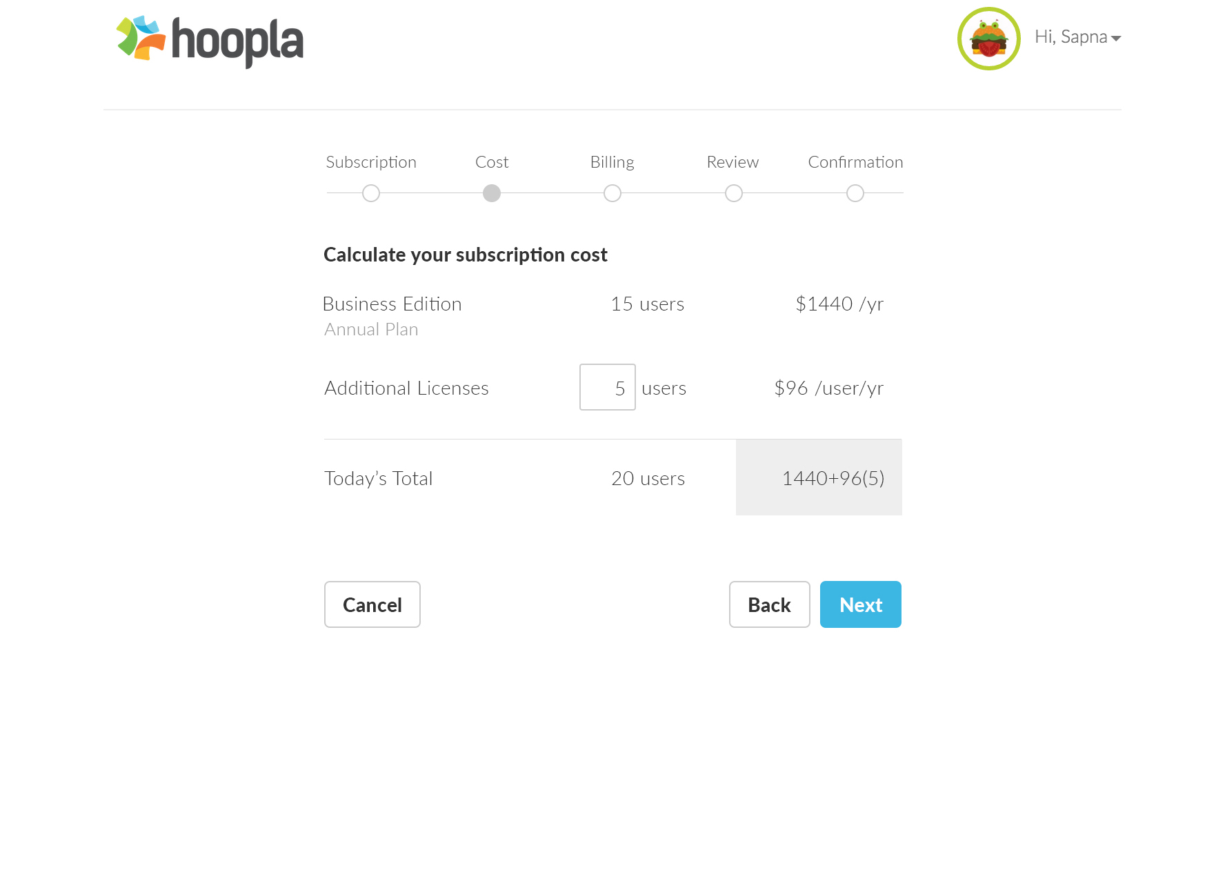
Cost calculator
The other dimension to our pricing model - which used to be a point of confusion in the purchasing process - was the minimum user cost. The second step in the initial purchase flow enforces and explains the user minimum and acts as a cost calculator. By having a clear and interactive breakdown of their cost early in the purchase flow, admins are no longer surprised by some seemingly inflated cost when they are about to pay.
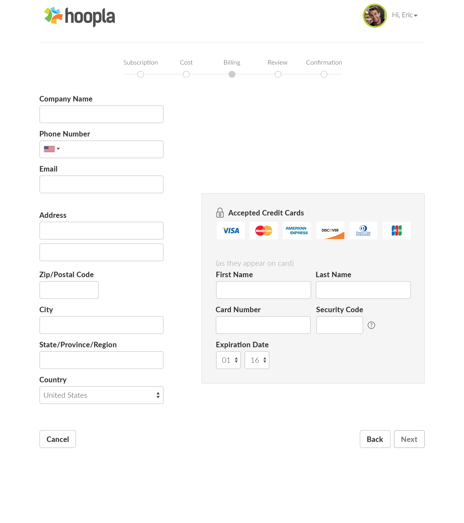
Billing
My goal was to make this part of the process as painless as possible, but to also make the form feel trustworthy and secure.
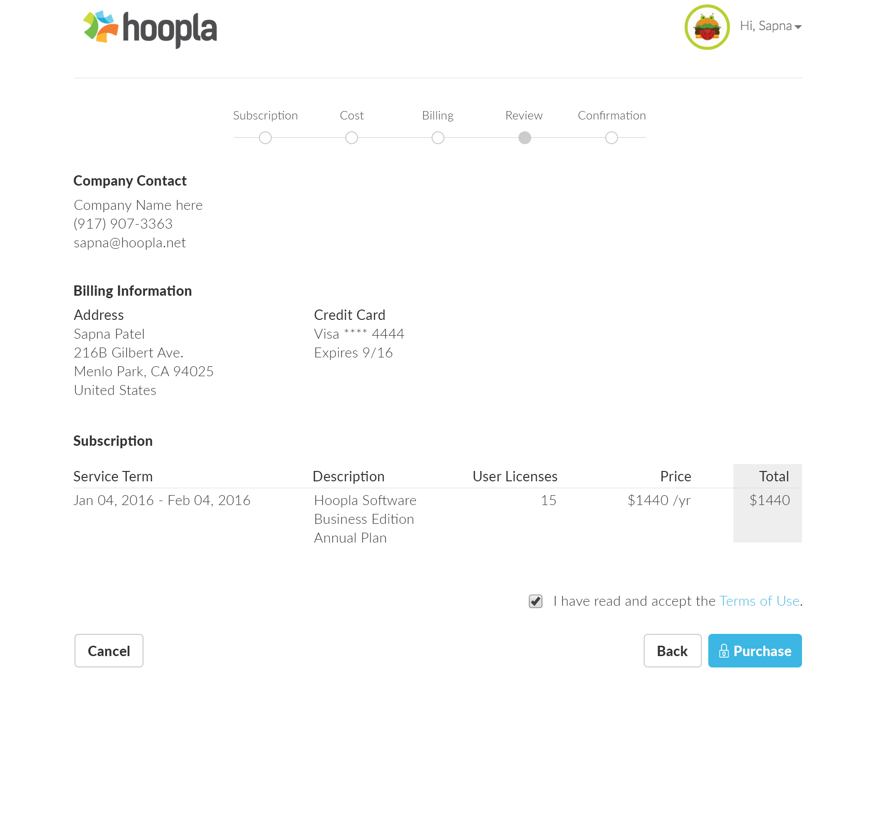
Review
Another common point of confusion for customers has been the Recurly invoices they receive from us. While we couldn't change any of the invoicing for this iteration, I used the review/confirmation pages to clarify any potential points of future confusion. The review is sturctured similarly to the invoice they will receive, but we have carefully outlined everything their purchase includes.
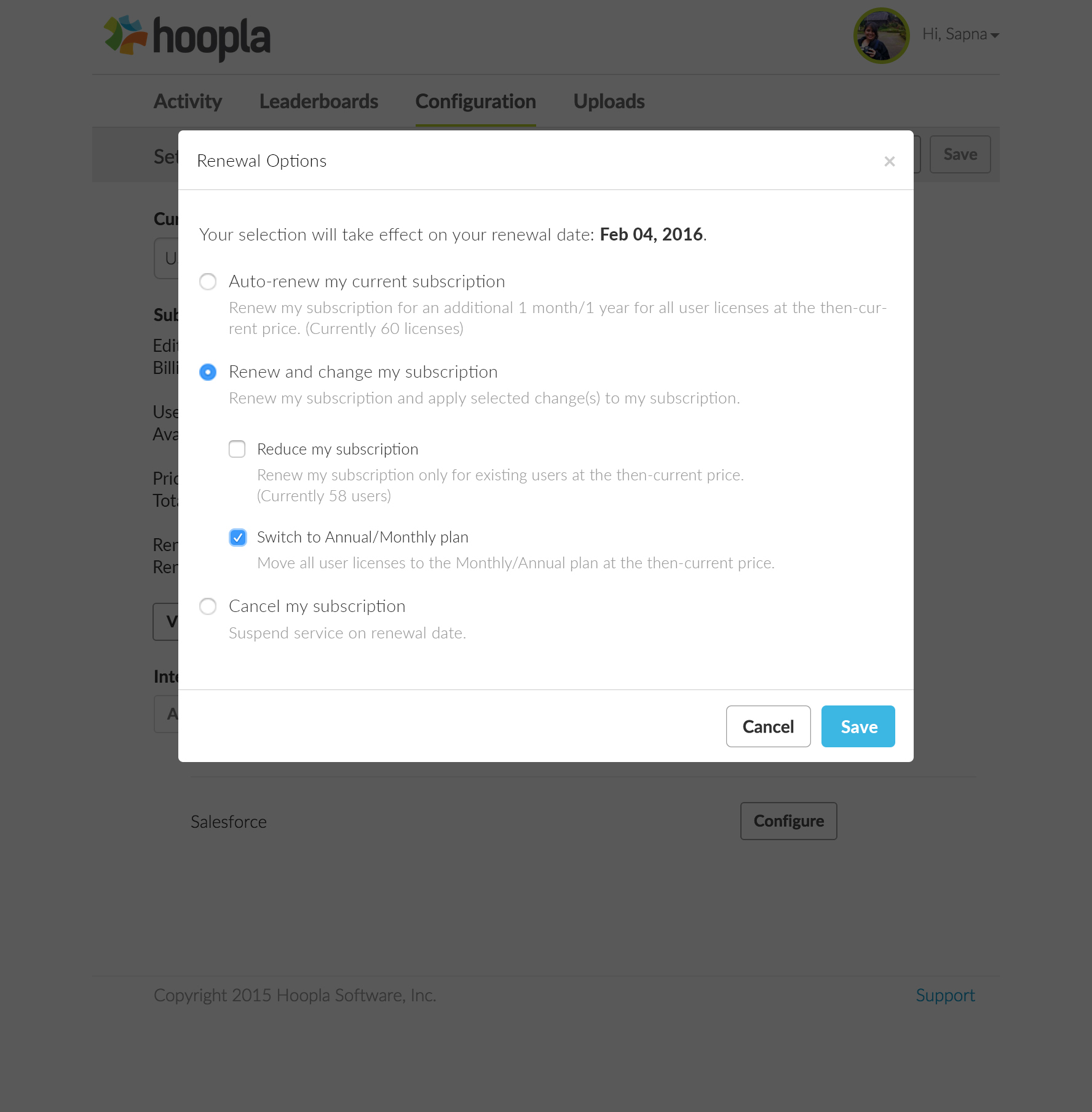
Renewal options
Paying customers can now make any renewal adjustments in one centralized place that they can access at any time.